|
In my January minutiae post
I asked, “If you were to travel back in time and show a recent logo
to designers from the past, what would they make of it?”
Now I want to expand that question beyond a simple logo, by discussing
the example that prompted this topic in the first place: the trade dress
of James Michener novels.
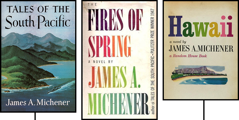
The dust jackets of Michener’s early hardcovers have, to my mind, held up very well. Here are a few of them: |
|
|
Tales of the South
Pacific (1947) may look dated, but
it’s charmingly dated, with hand lettering over a pleasant
painting.
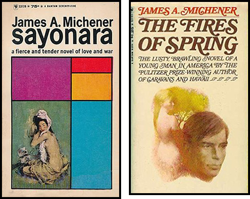
The Fires of Spring (1949),
all type, uses fonts that are still in common use today!
Hawaii (1959) is not quite so
timeless but it looks fine.
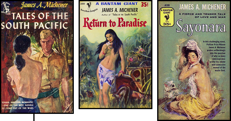
The same cannot be said of the paperbacks that followed on the heels of these hardcovers: |
 |
|
As most editions proudly proclaim, Tales of the South Pacific
won the Pulitzer… but this
paperback (1952) makes it looks like smutty
pulp, with a G.I. leering at a topless wahine.
On the first Return to Paradise
paperback (1952), the topless wahine looks
at the reader and invites him (most assuredly “him”) to do the
leering.
And while the Sayonara
paperback (1955) does talk up the author as
a Pulitzer winner, look at how it does so, in the lurid copy accompanying
the naughty picture with sideboob and coin slot: “In this challenging
novel, Pulitzer Prize Winner James A. Michener probes unflinchingly
into the question of why so many American men prefer the tender and
submissive women of the exotic East.”
For fuck’s sake.
Eventually I want to talk mostly about fonts, but I was amused to discover that for a while two lines of Michener paperbacks developed in parallel, one promoting him as a respectable author you could read on an airplane without embarrassment, and another continuing to appeal to prurient interests. Check it out: |
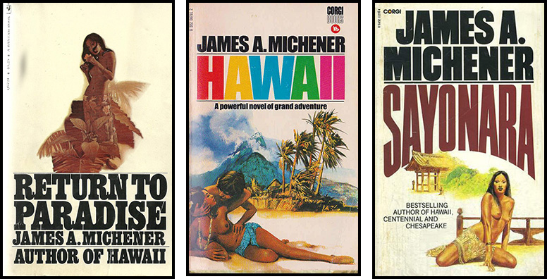 |
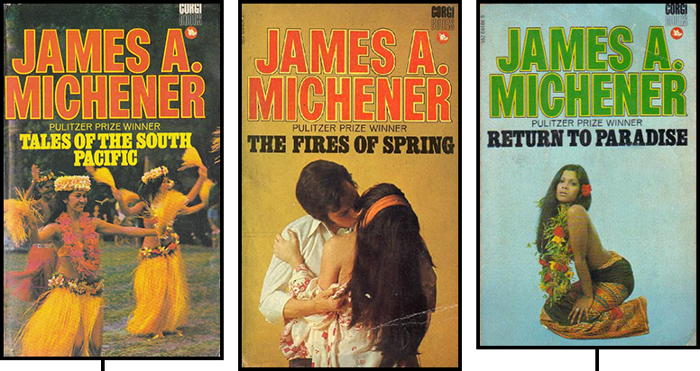
| These editions of Return to Paradise, Hawaii, and Sayonara are from 1966, 1974, and 1979 respectively, but they are just three out of many I found from between 1962 and 1985 that announce, “Hey, check it out! The ’50s are over, so we don’t need to be coy anymore—we can put nipples right on the cover! So buy this book! A thousand pages of nipples, probably!” Also worthy of note is the shift from covers that are illustrations, in full‐bleed color, to covers that have illustrations floating on a white background. That’s not just an artifact of the covers I selected, because the other dozen or so I could have posted in this category followed the same trend. Now look at these: |
 |
|
Photography appears for the first time, and wow is it awful.
That Fires of Spring cover in particular looks like
it’s from a basement porn shoot, taken on Polaroid and printed
on newsprint.
I’m not sure exactly how to date these—a couple of
sources say 1974 while one says
1970.
In any event, the covers above are painful.
The covers below, by contrast, are hilarious:
 That Sayonara is from 1966. The previous year Yves Saint Laurent had made a big splash with his collection of Mondrian dresses, and Bantam apparently decided to get into the act. Of course, Mondrian would never have used purple, so I guess this is more of a Van Doesburg. The Fires of Spring there is from 1969, as if you couldn’t tell from the fact that not just the title, and not just the author’s name, but the entirety of the long‐winded cover copy is in ALL‐CAPS Bookman Italic Swash! Ha ha ha ha ha! Seriously, even when I was a kid writing a story on a Mac for the first time and decided that all the dialogue by the magical creature from another dimension should be rendered in Zapf Chancery, I didn’t use all caps. (Though maybe Bantam was just overcorrecting from Sayonara’s use of no caps, which is just as bad.) |
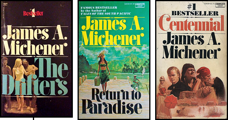 |
| The Drifters, first published in 1971, is (I have read) about young hippies wandering to such places as Morocco and Mozambique. Perhaps because it was about hippies, or perhaps just because it was 1971, the hardcover edition introduced this font, which carried over to the paperback line. It’s chunky, it’s bubbly, it promises a fun, light‐hearted story. Surely nothing too ponderous or depressing could be hiding behind a cover with such a jaunty letter r on it, right? No old Arapaho women being scalped by soldiers while still alive, say, or Dust Bowl mothers gutting their babies with kitchen knives. Not when your letter s has not one but two big cheerful ball terminals! |
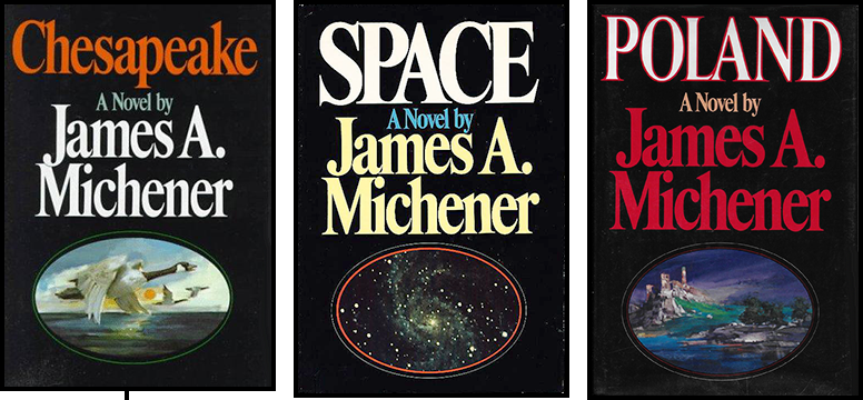 |
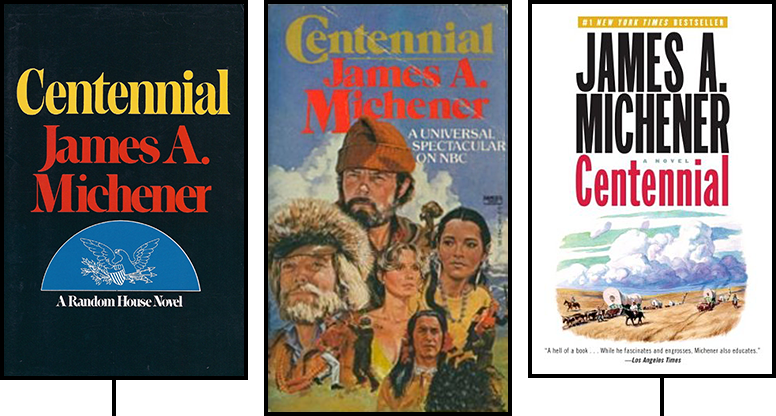
| As far back as The Source in 1965, Michener hardcovers had been issued in somber black, but with Chesapeake (1978) we see the beginning of a period of standardization not just of background color but also of font and illustration. Those ovals look distinctly old‐fashioned to me—like something you’d see in an antiques shop—which actually works well for the geese and the castle. Less so for the galaxy. In any case, the ovals would stick around throughout the 1980s. The typeface is a variety of condensed Times, more serious than the casual Drifters font, and it didn’t last quite as long: starting with Texas (1985), we see some customization: |
 |
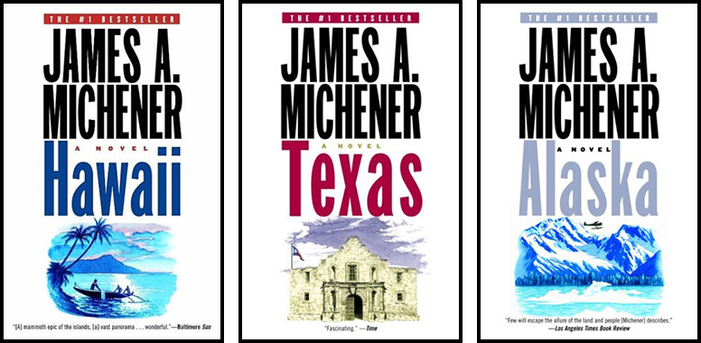
| I owned these editions of Texas and Alaska (1988), so this is the trade dress that I associate with Michener. I also saw enough of the paperbacks of the same era in Waldenbooks and the like that this too looks to me like a natural way for a Michener book to look: |
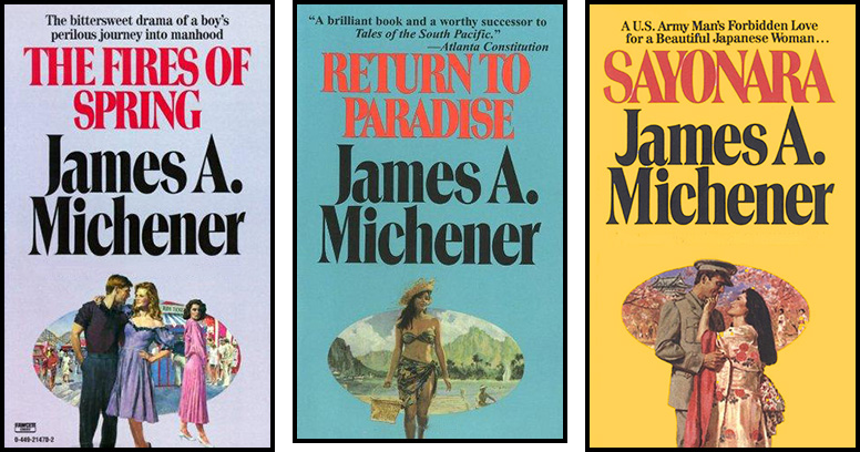 |
| Since these are paperbacks, we get a varied palette of colored backgrounds, and a more wedge‐heavy variant of Times has been selected as the font, but still, this hews pretty closely to the hardcovers of the same period. (I believe these paperbacks were issued in 1984, except for Sayonara, which was ’83.) It’s kind of funny how the publishers retrofitted ovals onto these decades‐old titles. Because without the ovals, who would believe it was really Michener? |
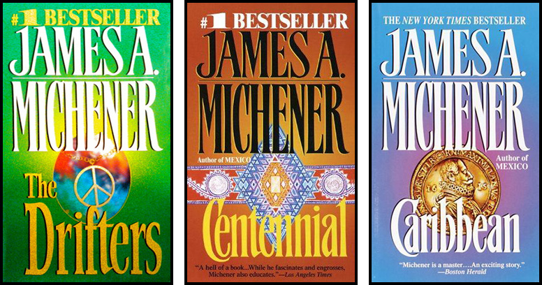 |
| That said, in ’86 these paperbacks were rolled out: no ovals, emblems rather than landscapes or people, and garish colors. We also see a font change, though my OCD is not pleased that Michener’s surname has been stretched while his first name has not, and it’s in conniptions over the fact that the center vertex of the M in “JAMES” touches the baseline but the one in “MICHENER” does not. In any case, something about this design just screams “cheap mass‐market paperback” to me. |
 |
|
And this set almost screams
“self‐published”—though it’s actually
the Random House trade dress that was released in
2002.
It’s certainly a departure, with the stark white backgrounds and the
equally stark sans‑serif font.
I’d even go so far as to say I like it—but it still
looks like it belongs in the discount bin.
But here’s what prompted me to write this post in the first place. As I noted earlier this week in my article on Centennial, when I revisited the novel I listened to the audiobook, so even when I was halfway into it I hadn’t yet seen the most recent cover. I still had in mind covers like these: |
 |
|
So I was thrown for a loop when I finally did happen to see what the
Centennial paperback looks like nowadays:
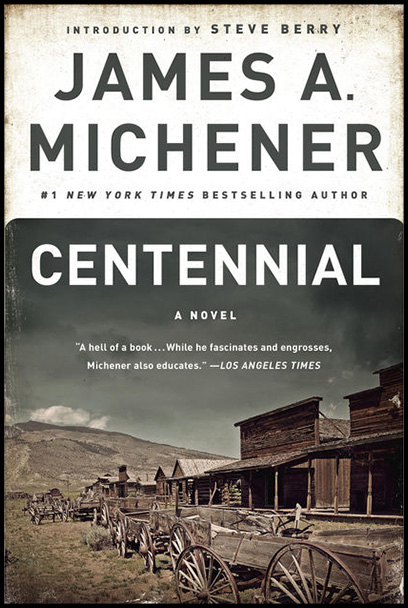 That… that looks like a modern work of literary fiction! The photo is choice—they say a picture’s worth a thousand words, but Centennial is apparently 436,595 words long yet never gave me as clear a mental picture of the town as that photo does in an instant. I looked up some of the other titles in this latest set (which appears to have been rolled out in 2014 and 2015) and was wowed over and over: |
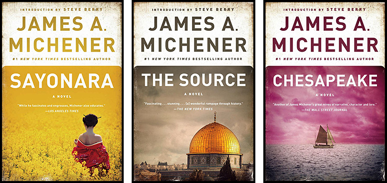 |
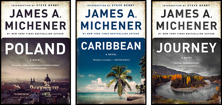 |
|
The designers somehow managed to find photos that were both evocative
of each book’s contents and striking in and of
themselves—and which combined to create an
eye‐catching palette when displayed together.
And the text is cleaner and conveys more seriousness and prestige than
the serif type of yesteryear, which went from goofy to staid to
chintzy.
I could hardly believe my eyes—these covers looked so
good!
And I wondered: if you could take these new editions back in time and
show them to publishers’ graphics teams of previous decades, how
would they react?
Would they be stunned by how far the field of cover design had advanced,
or would they still prefer their ovals?
But having now written all this up, I think I have a sense of what the
answer might be.
Because I can imagine someone in the future looking back at these books
and saying, “Wow, they really set the type in FF Din Bold?
How 2010s can you get?”
I can also imagine people of any era rolling their eyes at the fake
aging effect used around the edges.
I myself couldn’t stop a concerned frown from crossing my face as
I considered the rounded top corners of the photos—the
actual corners of the book are square, so that’s a mismatch that
seems a little weird now that I really look at it.
So maybe people in the past would find the font choice too austere, or
would find the photos to lack the warmth of the paintings, or might not
like how each cover is divided between a photo and a white block.
As much as that last set of images looks to me, right now, like a
dramatic improvement over what had come before, I suppose the new design
is not objectively better, and might well not appeal to people in
different eras, or even to everyone in this one.
(However, it is objectively better than the one with the whole
paragraph of all‑caps Bookman Italic Swash.)
|
||||||||||||||||||||


