The short of it is, I'd walk into a computer game shop and want nearly everything. Nowadays, I poke around and nothing really catches my eye other than updates of games I liked over a decade ago. Variety has disappeared; an aisle might be yards long and have multiple shelves and all the games are copies of each other. Shooting games, or real-time war games, or sports games... nothing inventive. Or at least that's how it seemed. Then it occurred to me that perhaps there's tons of great stuff out there lurking behind the bestselling clones, so I poked around sites like The Underdogs and such, and eventually ended up at Popcap. I ended up downloading most of their offerings. Bang, there went the next several evenings.
When people talk about Popcap games, the two words that invariably come up are "simple" and "addictive." The former certainly fits: I was about to say that these are games in the tradition of Tetris, but Tetris's interface is actually quite complex compared to Popcap games, which generally require nothing more than a one-button mouse. As for the gameplay, again, no need to pore over a hefty rulebook: these games tend not to get much more complex than "put the colored blobs together and they blink out." I briefly wondered whether there might be a cause-effect relationship here, whether simple concepts were inherently more addictive than more complex ones, but that seems not to hold much water: the notoriously addictive Civilization is quite complicated (though of course it stops feeling complicated once you're used to it), whereas there are plenty of simple games, including Popcap ones, that were quite easy to turn off mid-game. Sometimes a simple ruleset yields deep strategy — go is the classic example of this, but stuff like Popcap's Big Money also has more to it than is initially obvious — but this is not the primary reason Popcap's games are so compelling. The skeletons are borrowed and of varying quality. Where Popcap succeeds is in its skins.
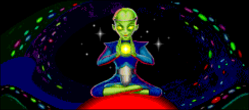
One thing I've said more than once in reviewing pieces of interactive fiction is that, above all else, you have to give the player a reason to type something other than >QUIT. The same holds true for games like these: you have to give the player a reason to click something other than the little red box with the white X in it. Civilization does it by never giving the player a break: each turn starts where the last one did, and there's always something that needs to be done, one last urgent matter that needs to be attended to before taking a break, a city to defend, an island to explore, a building to complete. In Popcap games, the thing that needs to be done next is less interesting: "move another colored ball" or "spell another word." The game is not its own reward. So... Popcap doles out rewards at frequent intervals. Popcap games share a lot of code, but more than this, they share a fundamental structure: "Level Up!" You finish a round, you get an amusing current rank (each game has its own theme for these) and a piece of artwork to go with it... and you learn exactly how many points you'll need to see the next rank and picture. The effect is transformative: it's no longer "I need to clear some more tiles like I've been doing for the past five hours" but "I need to get to 900,000 points and see what comes next!"
Of course it helps that the art tends to be nice to look at: not just the little drawings between rounds, but the whole package. This was another thing that Popcap really brought home for me: the chrome matters. If you want people to stare at a window for an hour it really helps if it's pretty. And it occurred to me: yes, a beginning CS student could clone the fundamentals of a Popcap game (which, as noted, tend to already be cloned from elsewhere), and yes, the only difference between the two will be that the Popcap version has nicer trimmings... but Popcap games also have nicer trimmings than the big-name games with the million-dollar budgets. I didn't lose interest in computer games just because of their diminishing variety; I lost interest because they became really ugly. They traded in drawings and paintings for rendered polygon meshes with textures slapped on and to my eye that's still a giant step backward.
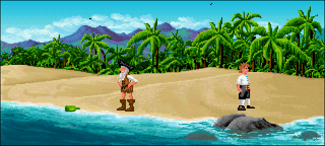
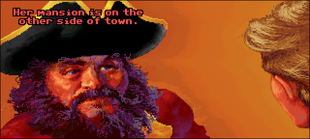
Here are some examples. When I was in college, my roommate (then a tester at Lucasarts who eventually worked his way up to lead programmer on Grim Fandango) introduced me to The Secret of Monkey Island, a hilarious and fun adventure game. For the time, its graphics were excellent, usually consisting of pixel renderings navigating painted backgrounds, but switching to fully painted for some conversations:


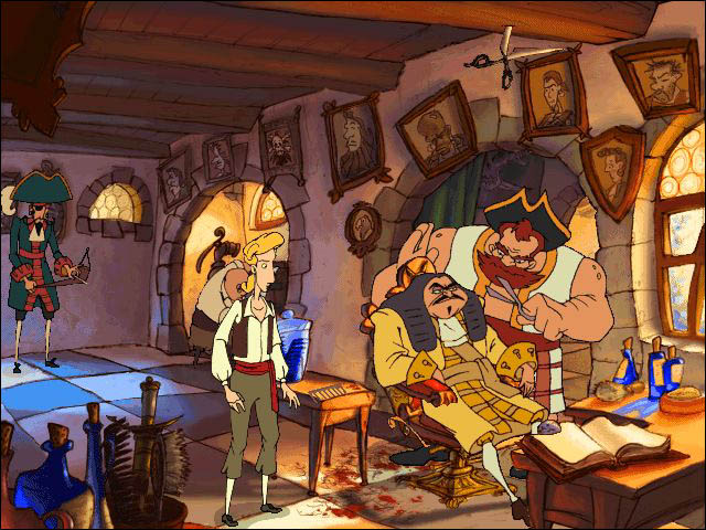
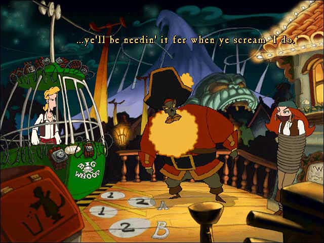
The sequel looked much the same. For the third installment, however, computer graphics had come far enough that this would no longer do, and Lucasarts switched from blocky pixels to an expressionistic cartoon. The switch took a bit of getting used to — since when did Guybrush have a big ol' schnozz? — but in the end it made for a terrific-looking game:
And then for the fourth game... disaster. Apparently the modern computer game market demanded hideous 3D, even when wholly inappropriate:
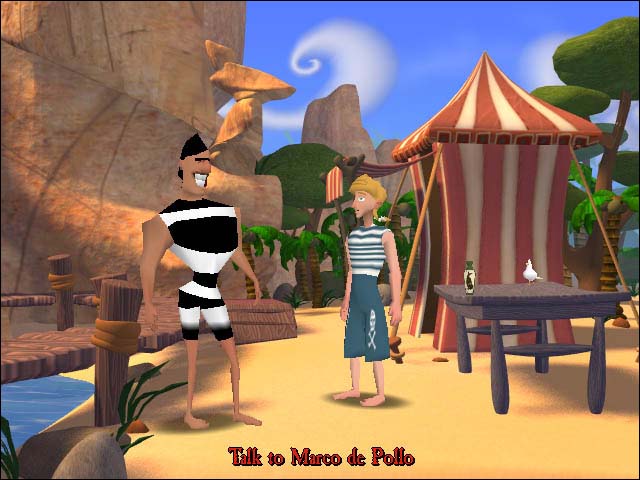
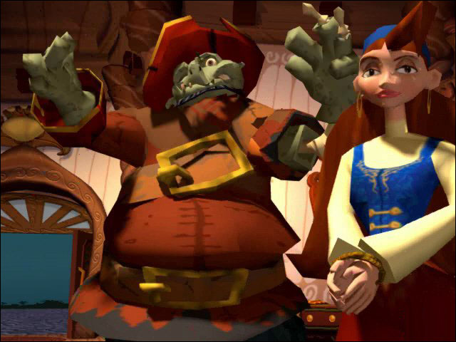
I mean, what the hell is that? That's crap! Everything's all pointy or jaggy or blurry and everything's all plastic-looking... even the rendered scenery is worse. The backgrounds from the first Monkey Island game put this to shame, pixels and all. Much as I enjoyed the first three Monkey Island games, I haven't come near the fourth — I just can't stand to look at that.
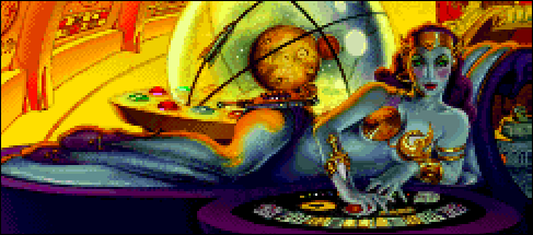
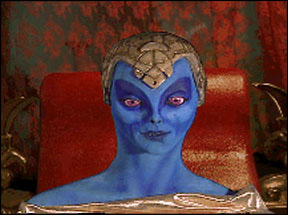
This sort of thing wasn't just confined to the Monkey series. Star Control is another example of a series whose beautiful art was ditched in favor of more "realistic" but uglier art:
| Star Control 2 | Star Control 3 |
|---|---|
 |  |
 |  |
Anyway... that was kind of a tangent, but yeah, it occurred to me in playing the Popcap games that a huge part of the reason I no longer buy computer games is that when I look at the screenshots on the back I don't like what I see.
Another lesson I've learned from the Popcap games is that games really benefit from having personality. From Rocket Mania's lanterns and dragons and beautiful dawn to Big Money's gruff mustachioed plutocrat to Atomica's sci-fi soundtrack, the game itself sort of takes a back seat to the persona of the game. I can't wait to see what the deluxe version of Insaniquarium might be like.
So, stuff to keep in mind as I drift away from pure text games into multimedia IF and even some non-IF projects. My senior year of high school I whipped up all sorts of games — a lightcycle clone, a breakout clone, a stock market sim, stuff like that — but only put enough effort into them to get the gameplay working. The substance was there, but not the polish. Beats the other way around, of course — but falls far short of having both.
 |