|
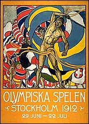
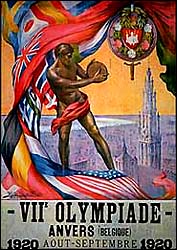
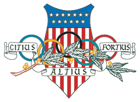
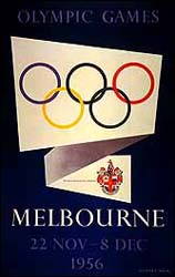
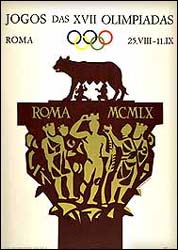
The Winter Olympics are underway, as immortalized in Wallace Stevens's landmark poem "Thirteen Ways of Falling Down a Mountain." Seeing as I moved back to California in large part so I would never have to think about winter ever again, I am not very excited about the Winter Olympics, though I am sure that the games in Torino will be every bit as good as those in Athinai and Moskva. No, my excitement came earlier, when the emblem was unveiled. I love Olympic emblems. I love to see how each city will represent its games as a colorful abstraction. These emblems are a relatively recent development; for three quarters of a century, the Olympics offered not emblems, but posters, some of which are very nice in their own right:
In the 1930s, these posters were reduced to single images, becoming much closer to the emblems of our day, though significantly more ornate:
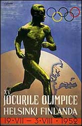
After the war the posters returned. They were pretty simple as posters go, but posters they were:
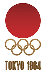
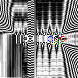
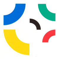
Then came the 1960s. On the Summer Games side, the posters lost their representational elements and became purely abstract, but hadn't yet developed unique emblems. Japan just repurposed its own flag, while Mexico offered a psychedelic logo but no emblem:
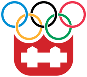
Meanwhile, the Winter Games of the 1960s came extremely close to supplying modern emblems; the only difference was that they were built around the Olympic rings:
So I tend to think of the breakthrough year as 1972, the first year that the Olympics used true standalone emblems — yes, they usually appeared next to or on top of the Olympic rings, but still, they were the unique elements that separated their particular games from all the others. First came Sapporo with its fat snowflake:
And then Munich with its completely abstract, geometrical, non-representational logo:
And that's what's fascinating to me. These artists were given a remit to create a design that somehow evoked West Germany at the tail end of the psychedelic era... and didn't they kind of succeed? Wouldn't this one have looked all wrong for LA '84 or Sydney 2000? Then we have this:
What is this? Is it supposed to be a stylized maple leaf? Are the rings plummeting down the page? Is that supposed to be the letter M somehow? If it's not representational, it's a failure, as it certainly doesn't look pretty on its own. Sigh... it took me twenty years to figure out the Expos' logo, too.
I don't get Lake Placid's emblem either. Is it a ski track? It looks like there's a mountain figuring in there, but then what's the vertical part? Not a big fan of this one. I don't like the lopsidedness and the combination of straight lines with a couple of random curves. Sarajevo's is, I assume, another stylized snowflake, though it looks to me more like a representation of the game Warlords on the Atari 2600, which I guess is pretty appropriate given the year. And speaking of the era, welcome to the Cold War:
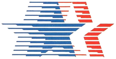
Doesn't this kind of sum up communism vs. capitalism in the 1980s? The Soviet emblem looks like something out of the early 1960s, much like the USSR's civilian technology at the time. "Comrade, you must design emblem that connotes reaching higher, and also building! For your service to the Motherland you will be given three extra ration cards and loaf of stale bread!" Meanwhile, the American emblem could only have come from a bloated advertising firm, and could not be more firmly rooted in the '80s without wearing an argyle sweater vest. I was living in Southern California at the time, and I saw this emblem, oh, about 500,000 times. I even tried doodling it from time to time but it was just too complicated. The Soviet one I could have done!
1988 brought us some good ones, Calgary with its stylized snowflake-slash-maple leaf and Seoul with a samtaeguk design. I remember seeing these all over the place too, and I didn't even live in Canada or Korea.
1992's offerings pretty much sucked, however. Albertville gave us a skiing flame wrapped in a flag of Savoy (currently burning all over the Muslim world due to its similarity to the flag of Denmark), while Barcelona produced this stylized jumping guy. Elements representing athletic competition returned — with ugly results. Then the Winter Olympics were moved so as to be staggered between Summer Olympic years. Thanks to the Tonya Harding vs. Nancy Kerrigan saga, the 1994 games got a lot of hype, so it's a good thing they had such a great emblem. Nagano's was very nice, too:
In between was Atlanta, which I knew going in had possibly the best emblem to date; when the city was awarded the games in 1989, this was printed in every newspaper:
The star, the circle, the A's, the Olympic colors... terrific! So imagine my horror when 1996 rolled around and suddenly this logo was everywhere:
What an eyesore! That color scheme! Gah! That was when I learned that bid emblems were not necessarily representative of the later official emblems of each running of the games. A bitter lesson! This lesson was repeated in 2000. Here were the candidates:
Sydney is clearly the class of this group, making it all the more disappointing when the official logo was just a rehash of Barcelona:
Salt Lake marginally improved on its bid emblem when creating its official emblem, though it's another fricking snowflake:
The 2004 group offered up some extremely impressive emblems, all representational but stylized:
These are beautiful! The Stockholm and Athens ones are less so than the others, true, but Athens then redeemed itself by breaking a string of bad official emblems with this wonderful one:
This brings us to the present. Turin improved upon its bid emblem, which wasn't bad to begin with:
Beijing learned from its 2000 debacle and offered up a much better emblem for its 2008 bid, only to follow in the footsteps of Barcelona and Sydney for the real thing:
Vancouver's bid emblem for 2010 wasn't terrible, but it didn't look remotely like an Olympic emblem. The official one does:
Time to move on to 2012... except the candidate cities didn't all supply emblems! London and Paris went with simple logos...
...and the emblems supplied by the other three were perfunctory...
Of course, even Madrid did better than some of the cities that didn't make it to the finals. Pittsburgh's emblem looks like it was cranked out on a copy of Corel Draw from 1989:
On the flip side, some other non-finalists turned in the best emblems of the year:
The next games to be awarded will be the 2014 Winter Olympics; the announcement is due in 2007. Those emblems will probably just be more snowflakes. But then in 2009 comes the selection of the site for the 2016 Summer Olympics, and Dubai is one of the contenders. If the skyscrapers being built in Dubai are anything to go by, this will be the most ostentatious Olympic emblem ever. I can't wait!
Return to the Calendar page! |

